


Vertical Lines in Excel Charts
The ability to effectively modify and enhance charts in Excel is a valuable skill. This article demonstrates how to add vertical lines to your Excel charts—something that can improve both the clarity and the visual appeal of your data representation. The chart types covered here are bar, line, and scatter plots.
We will explore different scenarios where a vertical line can be useful, such as adding an average line, a target line, a reference point, or a baseline. While Excel doesn’t provide a straightforward option for drawing vertical lines, this can actually be seen as a strength—Excel charts are highly customizable, and vertical lines can be added manually with a few extra steps.
How to Add a Vertical Line in a Bar Chart in Excel
In the first example, we will add a vertical line to a bar chart in order to compare the Nordic countries with the EEA (European Economic Area).

Image 1: A horizontal bar chart to which a vertical line will be added.
-
Add the coordinates for the line in the worksheet as shown in the image below. The value for x is the actual value you want to compare against, while y takes the values 0 and 1.

Image 2: shows the dataset. Note the x- and y-coordinates for the comparison line EES.
-
Right-click in the chart and select Select Data.
-
In the dialog box that opens, click Add under Legend Entries.
-
For the Series name, choose the cell containing the name of the series or type in a custom name. For the Series values, select the two x-values. Click OK twice to close the dialog box.
-
Two new bars are now added to the chart. Right-click one of the bars and choose Change Series Chart Type.
-
In the window that opens, select the Combo option on the left. For the new series, choose Scatter with Smooth Lines and Markers.
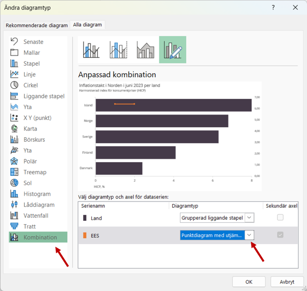
Image 3: shows the Change Chart Type dialog box.
-
Repeat step 2. This time, click Edit instead of Add. Now select both the x- and y-values for the series. A vertical line will now be added to the chart.
-
Double-click on the secondary axis on the far right of the chart. In the formatting menu, go to Axis Options and change the maximum value to 1.0.
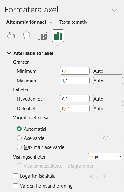
Image 4: shows the formatting menu. In the box for Maximum, change the value to 1.0.
-
At each end of the line, there are two markers. With the formatting menu open, click one of the markers to remove them. Do this by selecting Fill & Line > Marker > Marker Options > None.
-
Done! As a final step, select the secondary axis and press Delete on your keyboard.
Now, only simple formatting and an explanation remain. Personally, I like to use the chart title for this whenever possible. Another option is to add a text box close to the line. If you prefer this option, you can find text boxes under Insert > Text > Text Box. The final result can be seen below.
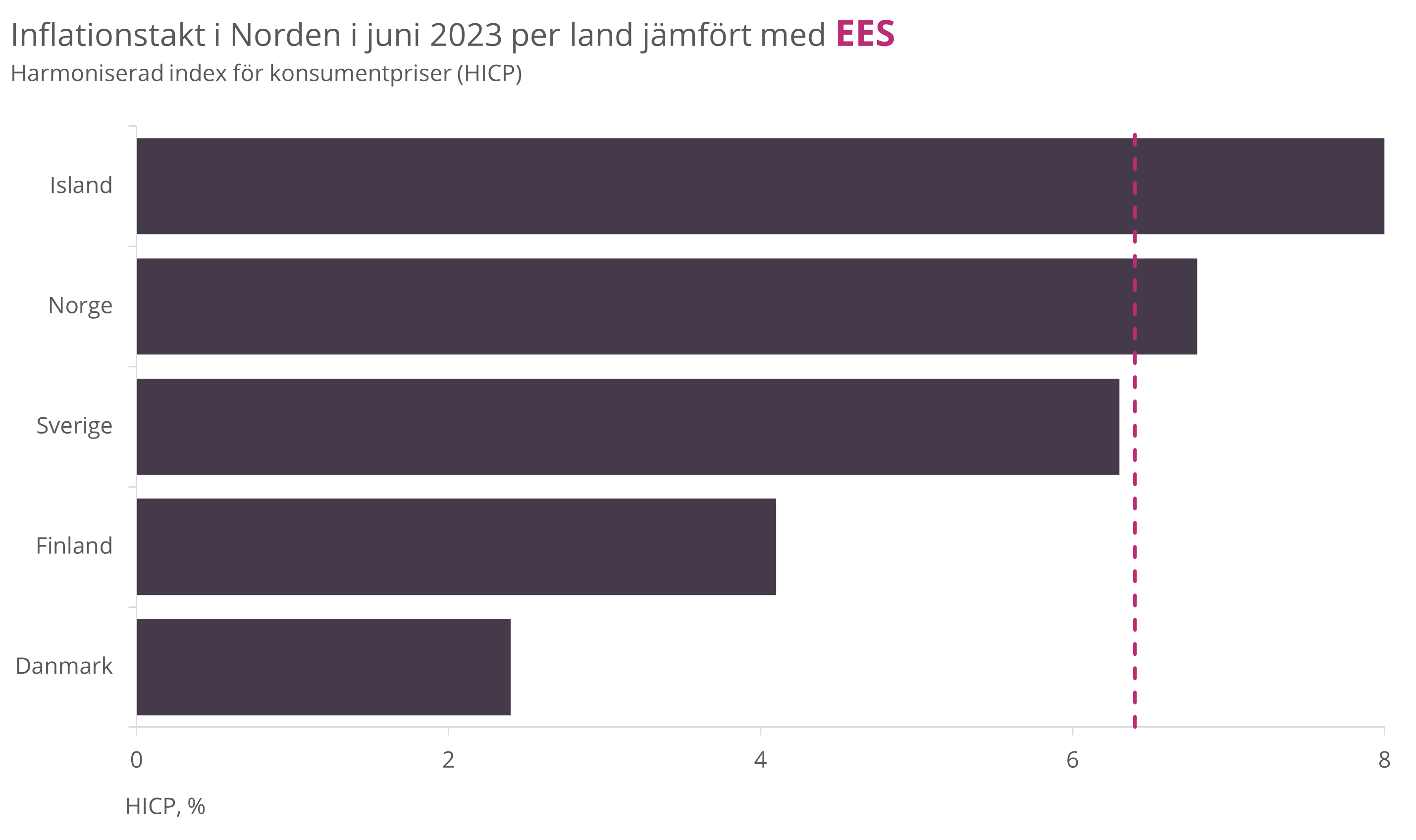
Image 5: the final result.
Note that in this case, it would have worked just as well to add EES as a bar directly in the chart. For the sake of the example, however, we’ll disregard that option.
Another alternative to adding a text box is, of course, to add a data label with the series name and, in this case, the x-value. To do this, click the green plus sign at the top right corner of the chart (Chart Elements). Click the arrow next to Data Labels > More Options. From here, select Series Name and X Value. Then remove one of the redundant data labels and move the box to a more strategic position. The result may look like the one below.
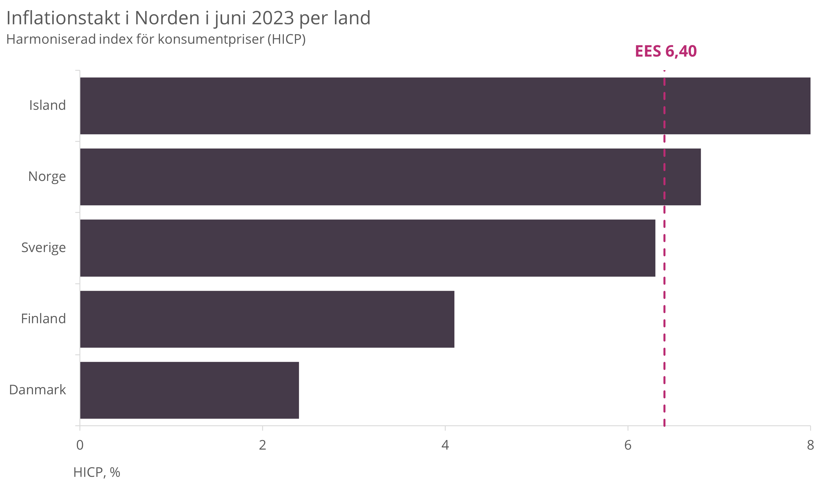
Image 5b: the final result. Here, a data label is used instead.
Below you can see all the steps in a short clip from Learnesy’s LinkedIn.
How to Add a Vertical Line to a Line Chart in Excel
To follow along with the example and explanations below, the Excel file is attached here.
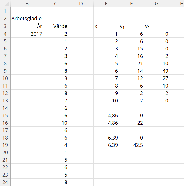
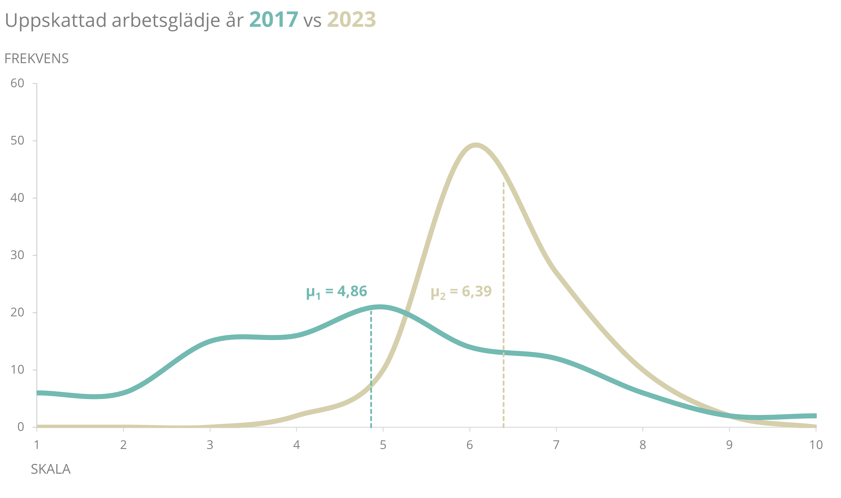
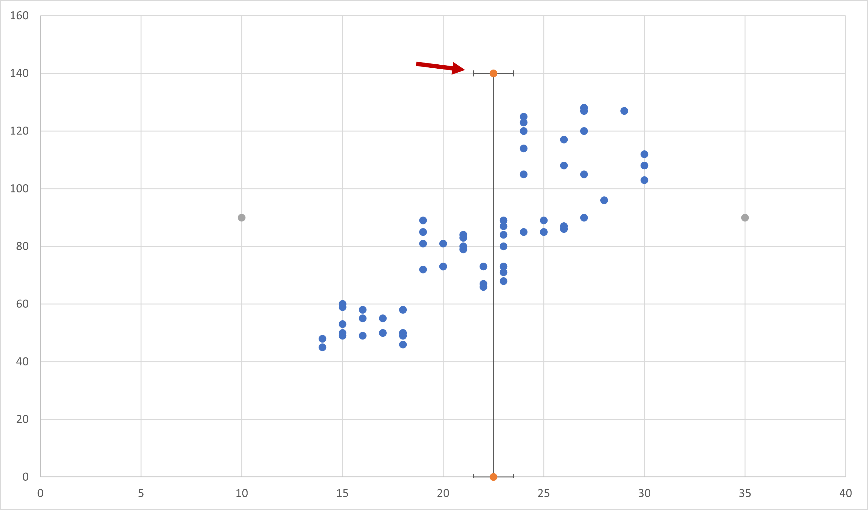
In this second example, two vertical lines will be added to a line chart. In this fictional case, the two curves in the line chart represent the distributions of estimated job satisfaction in a workplace for the years 2017 and 2023. The dataset contains a total of 200 observations—100 observations per year. By adding two vertical lines, we can show the respective means along the x-axis.
If we study the dataset in the figure below, the raw data is shown on the left (columns B:C). To the right, we see a frequency table. This table shows the distribution itself and is used to plot the line chart. For example, six individuals rated their job satisfaction as 1 in 2017, while no one rated their job satisfaction that low in 2023. Perhaps this fictional workplace has managed to deal with its dissatisfied employees?
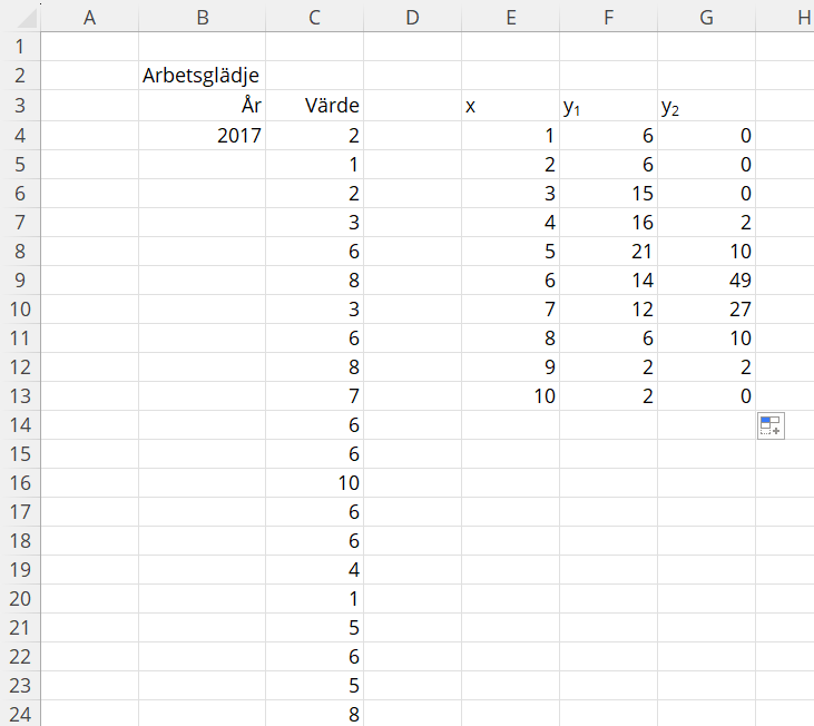
Image 6: Shows the raw data and frequency table.
To create the frequency table, the COUNTIF function was used. The generic formulas in cells F4 and G4 are:
-
Select the frequency table to insert a line chart.
-
Just like in the previous example, coordinates are needed for the vertical lines. To calculate the mean, the AVERAGE function was used:
These become the x-coordinates for the vertical lines. The y-coordinates have been chosen somewhat arbitrarily here. Of course, there are more sophisticated and precise ways to determine these, but they will not be covered in this article.