


Conditional and custom formatting in Excel, is it worth the effort?
Is it…? Is it worth the time you need to spend before you learn the function… and even after? There is a lot you can do with this function but I would recommend learning formulas and basic functions first. In answer to the question, yes it is worth the effort if you do not make it too complicated and won´t let it swallow too much time.
Read the post in Swedish here

Look at the lesson in Learnesys course Excel Essentials, about conditional formatting
Note! There is a difference between conditional formatting and custom formatting. The differences are these:
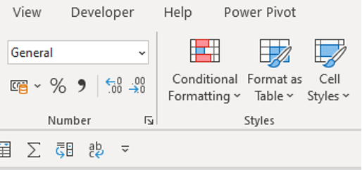
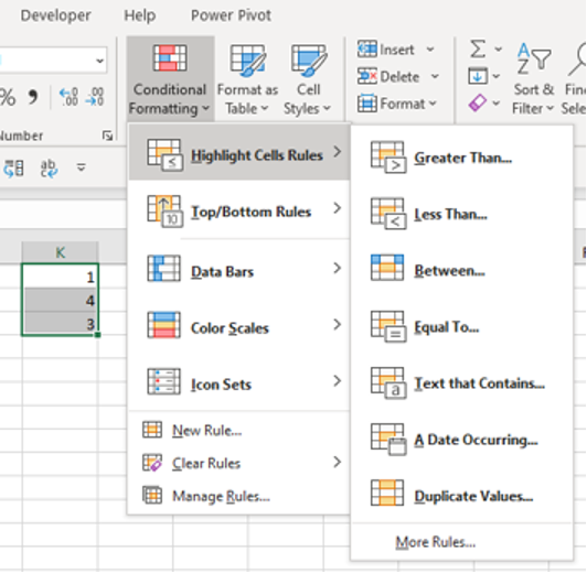
Conditional formatting is located under this particular menu as below and there are already set standard formats that can be adjusted:
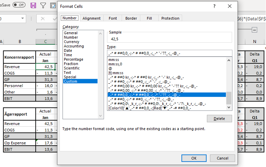
Custom formatting is located under format cells if you right-click or click on font settings under the Home menu. Here you set up the format you want to use.
Custom formatting is often considered to be:
- Faster on Excel performance
- Easier to arrange
- No need for duplication
- Possibility of using thresholds
Although after running a poll on LinkedIn for 1 week it turns out that 70% of the people responding uses conditional formatting the most. My conclusion is that many people start learning conditional formatting since it seems easier and then continues to use it.
Why format cells?
The idea is that with the help of formatting you should highlight or visualize important, interesting or protruding cells in Excel. The benefit is also to be able to draw conclusions when analysing the data by making it easier to discern patterns or critical problems. Tips from me:
- Keep it simple, do not spend more time on formatting than on analysis
- For analysis, find your formats that you think will help you in your work
- For reporting, think about how the audience receives the formatting
Conditional formatting
In analytical models, I recommend conditional formatting, colour scales and trend lines as these can help to discern patterns and give a heads up in case of any problems.
If you select an area, you can also click on quick analysis (Ctrl + Q) to do analysis and select formatting.
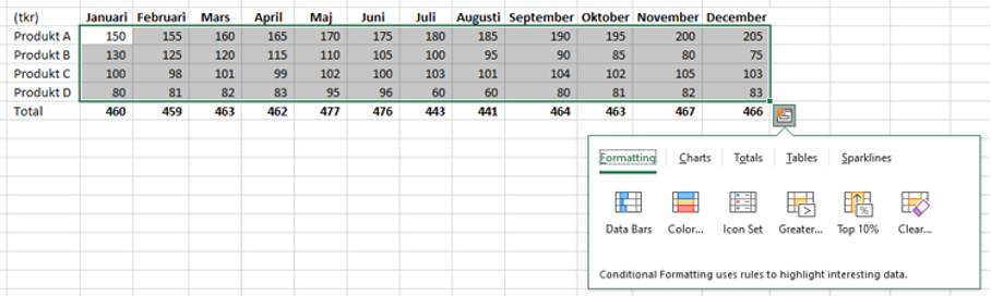
Keep in mind that the area you mark will be compared with each other.
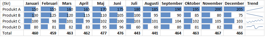
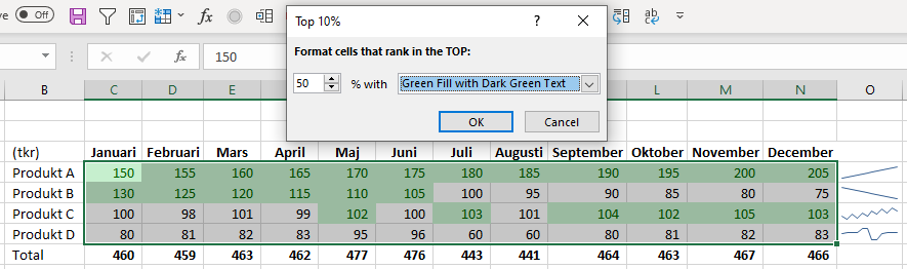
Under conditional formatting, there are a number of different variants that can facilitate the analysis work and you can quickly see which alternatives are available. There is formatting that deals with numeric values but also text or dates.
I mainly use conditional formatting when I want to quickly distinguish the data I focus on such as largest or smallest values.
Edit correctly!
A dashboard is ineffective if it is not visible, trying to have only the data that is needed and that the audience can absorb. Try learning formatting and keep your tongue straight in your mouth as you set color scales and icons. The best way to learn is by trying. Once I accidently gave positive key figures red icons… which was not happily received by the CFO before the board meeting.
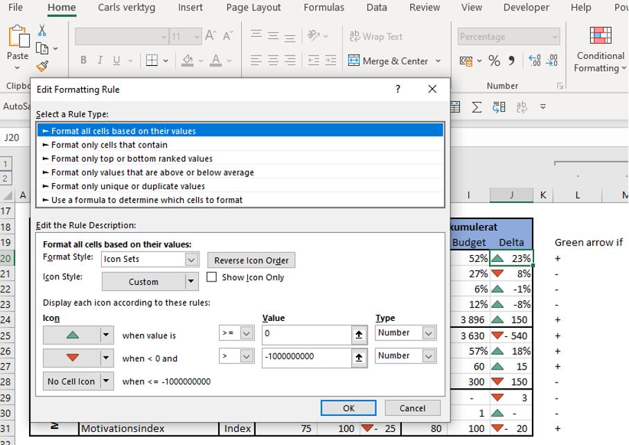
Icons and IF-functions
You can also by using an if-formula put the result icon outside the column with numbers as below.
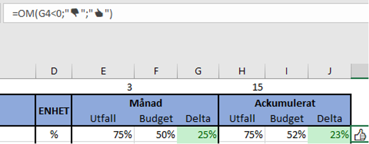
As previously mentioned, you get emojis through Win +. but you can also insert other symbols. Don’t forget to put “” around the icon!
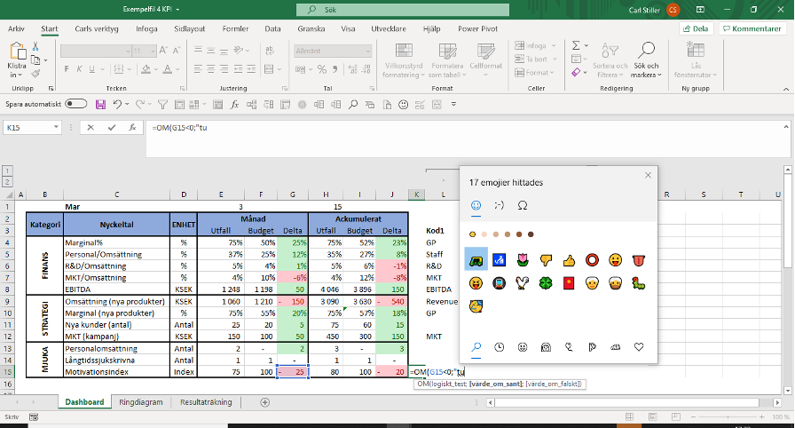
Above you see that this scorecard looks a bit “mushy” with only colour formatting in the cells. Here I would use simple icons such as;

Custom formatting
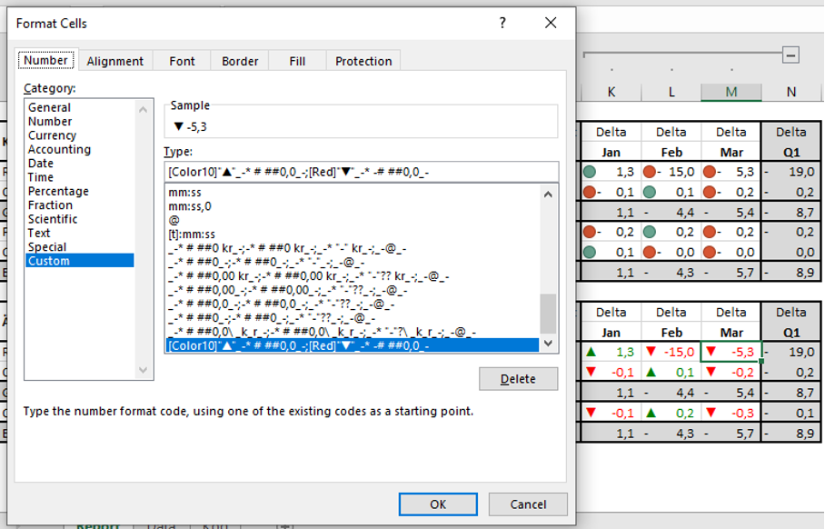
In addition to the initial advantages, custom formatting is also somewhat more professional, see below for typical examples of the difference between condition-controlled (upper delta) and custom formatting (lower delta).
In custom formatting, we could insert any color or icon we want to visualize the delta. Note that often the management team gets involved in how and what to reinforce in a presentation and then it is good to know custom formatting.
Briefly, custom formatting is structured as follows:
- ;;;
this is what the formatting consists of there; constitute different sections and these sections must be filled with info about the number format, any color and any icon. The first section is positive values, the second is negative, the third is zero and the last refers to text.
- # ##
means that the numeric values should be displayed, this info is added by color and suggested also by the icon information. If we want to show a value in % then we need to have 0% instead.
- [Colour10]
the colour information (in this case green) must be enclosed in parentheses and color scales can be found on the Microsoft website:
https://msdn.microsoft.com/en-us/library/cc296089(v=office.12).aspx
- “▲”
Icons are placed in quotation marks, if we want the icon after the numeric value then place it after all info and before the next section (;)
- [Colour10]”▲”_-* # ##0,0_-;[Red]”▼”_-* -# ##0,0_-
As you can see, it takes longer to learn the rules of custom formatting, but once you can, it brings some great benefits and is worth learning. In my opinion, the alternative also provides flexibility.
Formatting in reports and presentations
Here, the purpose is to highlight numbers and data for the audience rather than to analyse. The goal is to make the target group for the report aware of what is being shown. Icons and emojis are recommended as they give a simple message if something is good ?…or bad ?. Here I recommend that you use custom formatting.
Next post
In this post, we have dealt with formatting and also looked at the pros and cons of the two options. The conclusion is that you have to adapt your formatting according to need, knowledge and time. Learning to format cells in analyses and reports can provide great benefits for the work and is something you should master over time. The next post will be about correlations and the KORREL function, which is great for reconciliations and for implementing driver-based forecasting.
Feel free to connect with me on Linkedin and go to Learnesy´s website for more information.
Carl Stiller in collaboration with Learnesy