


Sanity check your data with disposable charts in Excel
In the world of data analysis, the term ‘sanity check’ is as crucial as it is constantly relevant. The term refers to a set of preliminary procedures performed on data to ensure its validity and usability before undergoing more detailed analysis. An innovative approach to performing sanity checks includes the use of “disposable charts”—a quick, efficient, and popular method within data analysis.
Use charts in the early stages of your data analysis
Disposable charts (translated from English’s disposable chart) are simple, often basic visual representations of data, created for the sole purpose of performing a sanity check. Unlike detailed charts and graphs intended for presentations or publications, disposable charts are meant to be quickly created, used, and then discarded. They are tools for the analyst, not the audience. The beauty of these charts lies in their simplicity and the speed with which they can be generated and interpreted. These can be advantageously created very quickly in Excel. Either with a few clicks or by selecting data and using the shortcut command ‘Alt’ + ‘F1’.
Why use charts in an early stage?
- Discover errors and anomalies: disposable charts enable a quick visual assessment of data. By plotting data in its rawest form, analysts can immediately detect deviations, gaps, or patterns that indicate errors. This can range from detecting missing values to identifying outliers.
- Efficiency and flexibility: creating detailed and polished charts can be time-consuming. For sanity checks, where the goal is to quickly validate data, the simplicity of disposable charts makes them a much more effective choice. Disposable charts can be created using a variety of tools; R, Python, or Excel to name a few. The simplicity of creating these charts allows for flexibility in the tools and techniques used.
- Iterative analysis: the charts can be used iteratively. As data is cleaned and refined, new charts can quickly be generated to assess the impact of these changes, ensuring continuous quality control throughout the entire data preparation process. Best practices for using disposable charts
- Keep it simple: the goal is to quickly check data, not to create a masterpiece. Use basic chart types and avoid unnecessary embellishments.
- Focus on the goal: each chart should be created with a specific sanity check in mind, whether it’s checking for deviations, understanding distribution, or assessing trends. Document results: even though the charts themselves are created to be discarded, the insights gained from them should be documented for future reference during the data cleaning and analysis process.
- Iterative approach: use disposable charts iteratively throughout the entire data preparation process to continuously validate the data.
A simple example of a scenario
In this example, a data set from the course Ekonomisk analys i Excel (in English “Economic Analysis in Excel”) is used, and is available for download here. What insights do you get when you choose to visualize the amount column, tkr, with a simple bar chart?
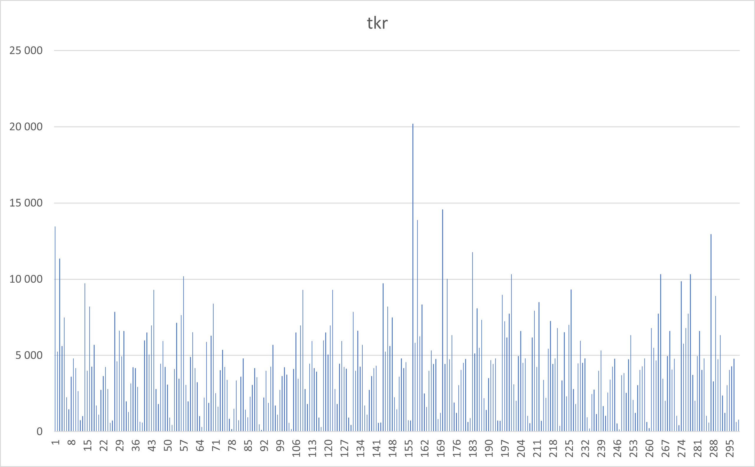
What can be quickly inferred from this simple bar chart? It can be seen that there are a total of about 300 observations. It can also be seen that most amounts are under 5,000 tkr, and that one observation stands out around 20,000 tkr (20 million kr). To inspect individual values, you can simply hover the mouse pointer over each bar.
What more can be inferred? Say the data material contained a simple processing error by adding an extra zero.
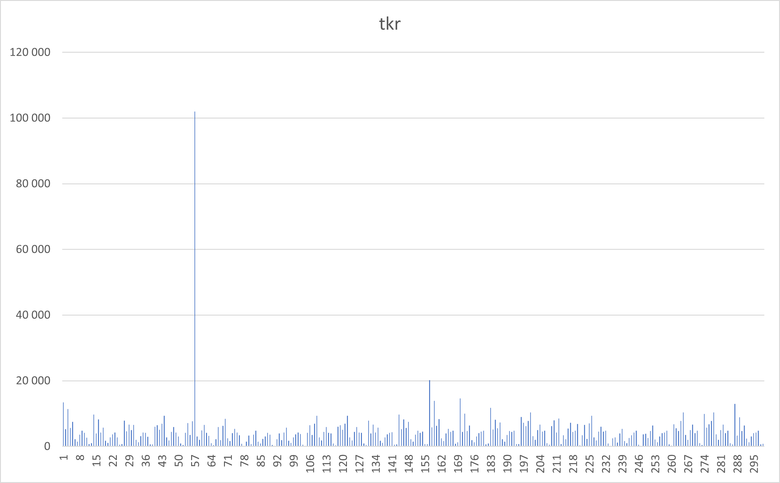
With a simple bar chart, it then becomes very clear that this value needs further investigation. What may seem to complicate further investigation of the value is that the x-axis lacks labels. This is not the case as you get an approximate index from the x-axis and an exact by hovering the mouse pointer over the bar.
Conclusion
In summary, disposable charts are a powerful tool in the arsenal of every data analyst. They are not pretty, but they offer a quick, simple, and efficient way to perform sanity checks with almost no effort. Sanity checks ensure that the data material used in the analysis is of high quality and reliable. As data becomes increasingly central to decision-making across various industries, the importance of effective sanity checks cannot be overstated, and disposable charts play a crucial role in this process.