Excel vs. Power BI – which one should you choose?
Comparing Excel and Power BI means comparing two powerful tools for data analysis and reporting, each with its unique strengths and use cases. Excel and Power BI also have some commonalities. In fact, they are built on exactly the same analysis engines.
What is Excel?
Excel is a spreadsheet software created by Microsoft and is part of the Office suite and Office 365 package. Excel is a versatile spreadsheet tool used to organize and analyze data with functions, formulas, and even macros.
Key features in Excel that make it an excellent tool for various data analysis tasks include:
Functions and Formulas: Excel has many predefined functions available, and you can even combine multiple functions to perform complex, customized calculations.
Data Visualization: Excel can present your data visually with just a few clicks. This makes it quick and easy to analyze data and present it in reports or dashboards.
Data Transformation: The Power Query tool in Excel allows you to load data from various sources, perform complex data transformations, and then import this data into your Excel workbook, something we also recognize in Power BI.
Templates: Excel templates are readily available from Microsoft when you create a new Excel workbook. It’s also easy to share your own templates with others or use templates created by others to expedite your data analysis. This is similarly possible with Power BI.
Excel is very useful and can be used for many different types of problems and applications. This has contributed to its popularity and made it a clear choice in many industries.
What is Power BI?
Power BI is a business intelligence tool. The main purpose of BI tools is to track key performance indicators (KPIs) and discover insights in data to make well-informed data-driven decisions within the organization. Power BI is used in various ways depending on an individual’s role, from developers, analysts, managers, and directors, to everyone in between.
Power BI consists of three main applications:
Power BI Desktop: a free desktop application for building and designing reports.
Power BI Service: the online publishing service for viewing and sharing reports and dashboards.
Power BI Mobile apps: for viewing reports and dashboards on the go.

Power BI Workflow
Many people follow a clear workflow in Power BI. Power BI can be used for all of these tasks, one, or a couple of them. The typical workflow is shown below.
Extract, Transform, and Load Data (ETL): Power BI makes it very easy to connect to data from files (Excel, CSV, etc.), databases (SQL Server, MySQL, etc.), cloud services, Microsoft Teams, and other sources. This is also possible, albeit somewhat less extensive, in Excel. Often, you also need to transform the data, such as merging tables, adding new columns, filtering out unnecessary data, and more. Power BI makes it very easy for users to do this.
Data Modeling: Build the data model by establishing table relationships and defining custom formulas (called “measures”). For more complex formulas, you need to use DAX. Data models and the DAX language are also available in Excel, something that will be discussed further below in the article.
Data Visualization: Add visual elements to the report by selecting visual components and dragging data into the appropriate fields. This works similarly to pivot charts in Excel. You can add charts, filters, tables, maps, advanced AI visual elements, text, images, and more to your report.
Publish and Share: In this way, colleagues can view and interact with your report by simply clicking on a link. You can set security restrictions on who can see what. Finally, you can set up scheduled updates to keep your report current. Note that publishing and sharing reports online requires a Power BI Pro or Premium license. More information on this can be found here.
Excel vs. Power BI – 5 Points
Learning Curve
Excel is a common tool with many users using it daily. This means that it is very likely that many users have heard of it and are very familiar with the program. Additionally, there is a wide range of resources and training available to learn how to use Excel in almost every use case.
Power BI, on the other hand, is a relatively newer and separate application. Although it is rapidly gaining popularity, there are still fewer resources available compared to Excel. Power BI is also considered a more complex application, requiring more technical expertise to build and implement solutions to business problems. This gives Power BI a slightly steeper learning curve than Excel. However, Microsoft has done an excellent job providing a user-friendly interface, and the application is much more intuitive to use than one might initially think.
Flexibility
Flexibility can be thought of on a spectrum from very flexible to entirely automated. There cannot be a situation where something is entirely automated and perfectly flexible. This is where Power BI shines. However, Excel is a highly flexible tool that can deliver uniquely customized solutions, as illustrated further below in the article.
Big Data and Complexity
Excel has a limit on the amount of data that can be stored and presented at once. Just over 1 million rows and 16 thousand columns, which is often sufficient. For data that exceeds this limit, the Excel workbook may either fail to open or only present parts of the data.
Power BI does not have this limitation and can handle millions of rows of data. When publishing reports to Power BI Service, you are only limited to datasets smaller than 1GB. In addition, Power BI Premium offers additional capacity at an extra cost.
Cloud-Based Features
Excel does not offer a cloud-based publishing service, and the only way to share an Excel workbook with someone is to send the file directly either as a workbook or a PDF file. However, collaboration is possible in an Excel file.
On the other hand, Power BI Service offers an easy way to share reports and dashboards with anyone within and outside your organization with a Power BI Pro license.
Visualization Options
Excel and Power BI have a core set of visualization options in common, such as bar charts, line charts, and pie charts. Power BI also offers a much wider range of visual elements, as well as custom visual elements available in a marketplace called AppSource. Not only that, but Power BI charts are highly customizable and can be made very dynamic.
However, it is possible to create custom charts similar to the one below in Excel, something I very much appreciate with Excel. This requires some technical know-how and a combination of functionalities and tricks to accomplish. Due to Excel’s popularity, there is plenty of guidance on how to create various charts in Excel.

Chart Interactivity
The only way to interact with a chart in Excel is through slicers, and to some extent, formulas that effectively filter the data.
In Power BI, you can interact with charts, tables, and visual elements in a much more fluid and intuitive way. You can also include more complex interactions like drill through, page-level and report-level filters, and bookmarks.
Summary
Many people do not realize that Excel and Power BI are built on the same analysis engines. Power BI adds powerful visualization and publishing tools to the data transformation and modeling capabilities found in Excel. Learning Power Query and Power Pivot in Excel also means learning Power BI, and vice versa. In fact, you can import your data models from Excel into Power BI. Pretty neat, right?
Which One Should You Choose?
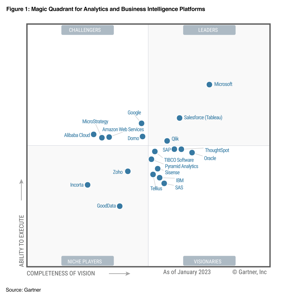
There is really no need to choose between Excel and Power BI, as they work very well together. Generally, Excel is ideal for exploring data, while Power BI is better suited for presentation and sharing. Similarly, Power BI’s ability to analyze large amounts of data makes it the best choice for data visualization. Its custom dashboards offer a 360-degree view, and alerts can be set up for key performance indicators.
When it comes to interactivity and features, Microsoft Excel is more limited for dashboards. Excel’s spreadsheet with data entries in cells helps visualize data in various chart formats but is not an ideal tool for larger datasets.
Power BI’s many features for formatting, natural language queries, editing or filtering make reports easier to understand, visually appealing, and highly dynamic and interactive.
Where Can You Learn Excel and Power BI?
At Learnesy, we offer a wide range of Excel courses as well as a course in Power BI. You can find all courses here.


