


PivotTables in Excel, something all Excel users should know!
PivotTables are something that all Excel users should master well and one of the first things one should consider learning. In this lesson, out of three, I will go through; how to make a PivotTable, uses for an economist, analytical possibilities and pivot charts.
Read the post in Swedish here
How to make a PivotTable
Making a PivotTable is super easy and is done according to the following 4 steps:
- Select a data range or a table
- Insert a PivotTable on the same tab or select a new tab
- Select factors for the rows or columns
- Add amounts such as sum, count, etc. to the value area
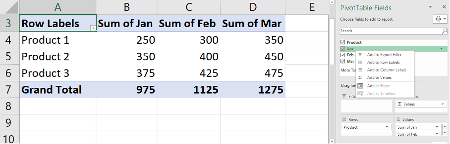
See below pictures for above instructions.
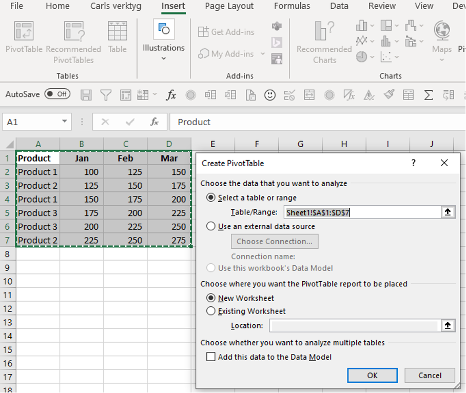
Insert the data range (my preference as I rarely work with tables) and choose where you want to place the PivotTable.
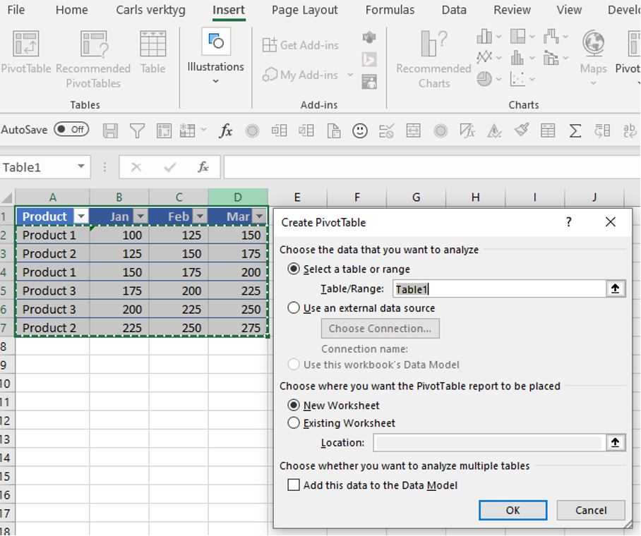
Or pick the data from a table where the advantage is that you never have to adjust the data range if values are added such as more products or months. You can then, instead of selecting data ranges, write the name of the table in “table /range”.
Select whether you want the months or products, as in this case, in rows in the PivotTable.
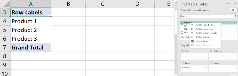
Finally add the months and since there are no more than two factors, these will automatically be added to “values” when you click in the boxes.
Look at the lesson in Learnesys course Excel Essentials, Create a PivotTable
Areas of use
The simplest version of reporting is done using PivotTables after washing the data, which I showed in a previous post. The tables are easy to learn and use and incredibly useful as their primary uses are to summarise, explore, analyse and present data. The good thing is that you can connect to external data sources, such as SQL Server tables and that you can filter the reports with a filter list.
I use PivotTables mainly for the work below.
- Statistical reports
- Sales reports
- Reconciling the accounts
- HR analysis, number of employees
- All possible analysis
Analysis
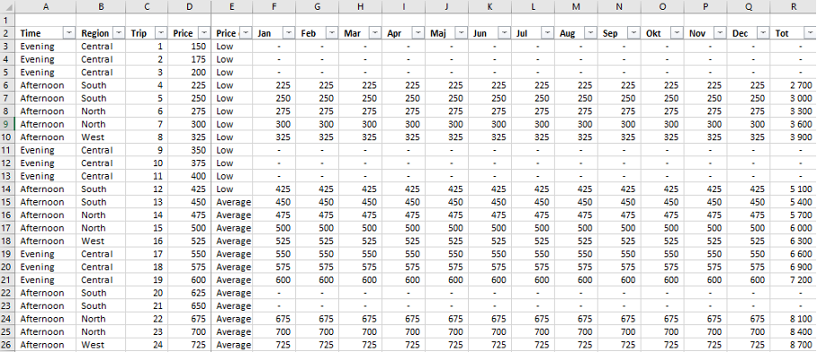
The good thing about PivotTables is that you can twist and turn the data and quickly analyse and draw conclusions. To exemplify the flexibility, I have put together sales information from a fictitious taxi company to show what you can get out through quick adjustments in the table. During my time at Taxi Stockholm, I worked with extensive price and travel analyses. For a business controller and statistician, this is incredibly fun and rewarding if you want to understand the business and engage in business analysis. Below you first see examples of the raw data that contains; price info, price category, region and time span:
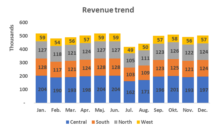
We can easily make an overall report on sales as well as a more detailed one where we show the areas:
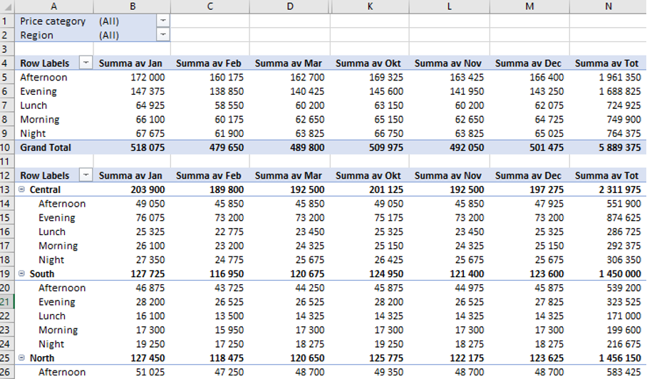
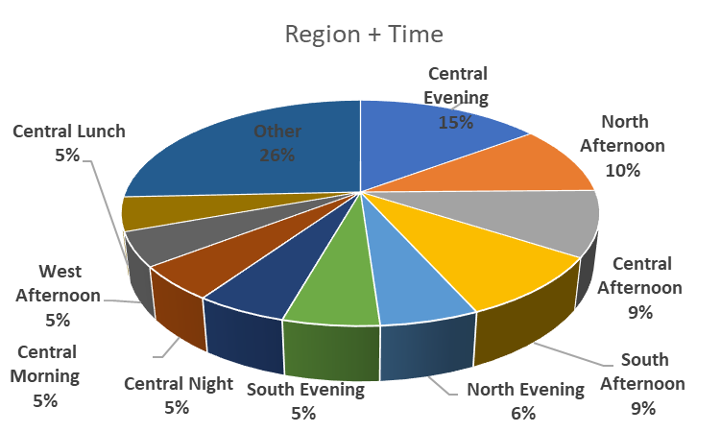
We see that Afternoon and Evening are the time spans where people spend the most on taxis, we also see that the Central part of the city is busiest and that the Northern part comes in second place out of 4. We quickly see which time spans are largest in each region. But we want to analyse in more depth which Area + Time is the largest so we create a new dimension called Area + Time to see the result of the combination:
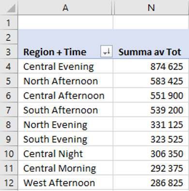
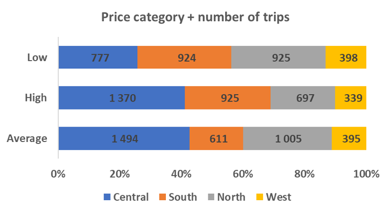
We can now clearly see which areas and time spans have the most sales during the year. As we have access to the price category in the raw data, we can also analyse this. By choosing the price category as one of the factors in our PivotTable as well as choosing the number of trips instead of the revenue amount of the trips, we get the frequency as below:
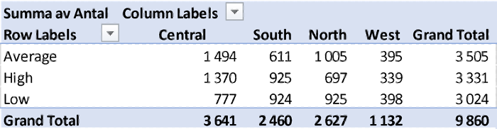
Using this picture, we can conclude that people travel differently in the different areas of the city.
In the Central and the North, most trips take place within the average category, but the highest price category is almost as extensive in the central city. At the same time, an equal number of trips take place in the highest and lowest category in both South and in the West. This makes us want to dive even deeper to better understand the Central, which is the most lucrative area.
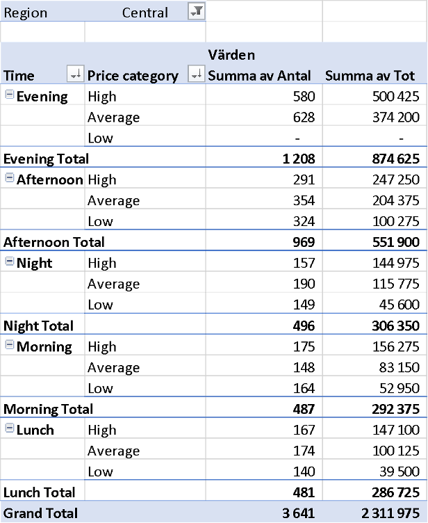
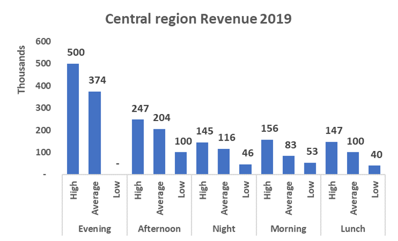
We see that evening is the most important success factor in the Central City and that you mainly take expensive taxi journeys regardless of the time of day. This type of information is important to know when making strategic decisions about where and when taxis will operate in the city.
Pivot charts
With the help of PivotTable charts, you can also make easy-to-understand pivot charts to present when conducting analytical discussions with, for example, the CFO, CEO or sales and area managers. If you stand in the middle of the PivotTable or click on the pivot chart function, you will get all the options. See below for graphs related to our taxi example.
Next post
We have now gone through what a powerful tool PivotTables are and exemplified how to turn the data and quickly produce different reports and make analyses.
Feel free to connect with me on Linkedin and go to Learnesy´s website for more information.
Carl Stiller in collaboration with Learnesy