


How to succeed with Doughnut Charts in Excel
Doughnut charts can be a perfect tool to visualize results or percentage of achieved goals.
The charts can be a bit complicated to put together if you have not done it before, however, they are simpler than you think and have been appreciated the times I have implemented them in management presentations.
This post includes an sample file, you’ll find it in the end
Read the post in Swedish here
What is a doughnut chart?
A doughnut chart is a chart designed so that 100% of something corresponds to the entire doughnut. If you insert the result that has been achieved, let’s say 75%, you will see very clearly where you stand against the plan… it can not be clearer than that.?
A doughnut chart can be made in several advanced ways with certain visual benefits, as well as in a simple way where you still get the most essential information.
The benefits of doughnut charts are:
- Provides a clear picture of the achieved results
- Visually appealing in a presentation
- Usually leads to good meeting discussions
The disadvantages are:
- If you want an advanced version, it takes some time
- Takes up space in a presentation
- Gives limited information
When do I use doughnut charts?
I consider doughnut charts to be suitable for the following reporting:
- Turnover
- Profitability measures
- Follow-up of strategic initiatives
- Project follow-ups
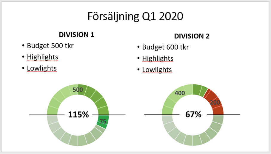
In my experience, doughnut charts are most useful for presentations at, for example, Town hall meetings or for management and the board. Doughnut charts provide a very visual impression while giving limited information. Thus, they are useful if you want to point out something very important such as an achieved goal or to start an important discussion.
How to put together a simple doughnut chart?
Use the following steps:
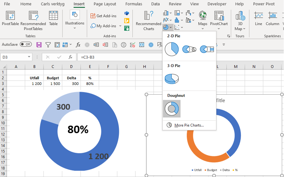
- Go to “Insert”…pie chart and then select doughnut chart.
- Insert the actual result and the delta between budget and actuals
- The completed percentage is entered manually by creating a text box
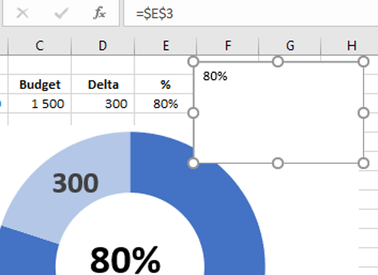
- Calculate the percentage (in cell E3 in below picture)
- Then, in the formula bar, write = E3 and…enter
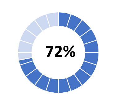
Variants
Below you see a couple of doughnut charts that take a little longer to put together. For the first one you need to work a bit with formatting of the fill and in the second case you need to add another data series to obtain the sections.

If you are persevering, you can experiment with the charts so that you get the best possible end product. If the result is over 100% … what does it look like then ?? I tested for a while and worked out the variant below where the chart is divided into 5 parts;
- actual result (if the actual is less than budget)
- delta (if the result is less than budget)
- delta (if the result is greater than budget)
- budget (which equals 180% of the chart)
- other part (for the chart to be 360%)
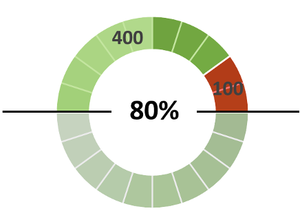
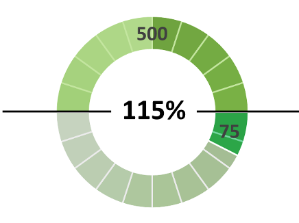
Pretty nice right? The budget is SEK 500,000 and in the first variant you have SEK 100,000 as a negative delta and in the second case you have reached over the budget with SEK 75,000. I also managed to make the green fill become darker over 50% achievement. Learning doughnut charts takes some time but when you master them it can be really presentable in a PPT presentation…?
See below for a sample file with the charts above so you can test and see how all variants in this post work:
Next post
In this post I have presented doughnut charts and how to use them plus a sample file. In the next post I will show how and when I use pivot tables.
Feel free to connect with me on Linkedin and go to Learnesy´s website for more information.
Carl Stiller in collaboration with Learnesy