


8 visualizations for your dashboard in Excel, part 1
This article is the first of two that covers eight fundamental visualizations for your dashboard in Excel. Keep in mind that it is important to choose the right visualization for the right occasion.
What is a dashboard?
In short, a dashboard is a visual and interactive report of important key figures with regard to a certain target group. You can ask yourself the following questions before creating your dashboard:
- What kind of data should you visualize?
- What do you want to present? For example, compare shares or demonstrate a distribution.
- Target group – to whom should the dashboard be presented?
See the lesson below how to easily switch between different charts to find the most appropriate way to present the data.
Exploratory and explanatory
Genrally speaking, there’s two types of dashboards – exploratory and informative.
For exploratory dashboards, the goal is to explore and profile data to see what insights emerge. Here, the reader is free to find insights in the data material. The dashboard is built in such a way that the end user can easily slice and dice the data to find these insights. It helps them make sense of the data and identify interesting patterns and trends.
With informative dashboards, the goal is to tell a specific story or explain exactly what happened and why. In this scenario, you have already analyzed the data and found the most important insights. The dashboard is there to clearly deliver these insights and recommendations.
A dashboard doesn’t have to be one or the other. You can often find a middle ground and combine the two. To enable both exploratory and informative analysis – design the dashboard in a way that tells a clear story, but also includes interactive elements that encourage exploration. This becomes particularly relevant when dealing with growing data sources. After all, you never know what insights will come next month. What you can do is design your dashboard in such a way that it becomes easier to find these insights. The key to doing this successfully is knowing what your end user is looking for.
4 important visualizations
First up are four essential visualizations.
- Table
- Line chart
- Bar chart
- Pie chart
Among these four, it is the table and the bar chart that stand out the most. This is because of their usefulness. It should also be said that the line chart is closely related to the bar chart, but is more limited to time series. Perhaps tables are not seen by many as a visualization, but the fact is that they are excellent for visualizing data. For example, small tables of aggregated values may be all that is needed in some cases.
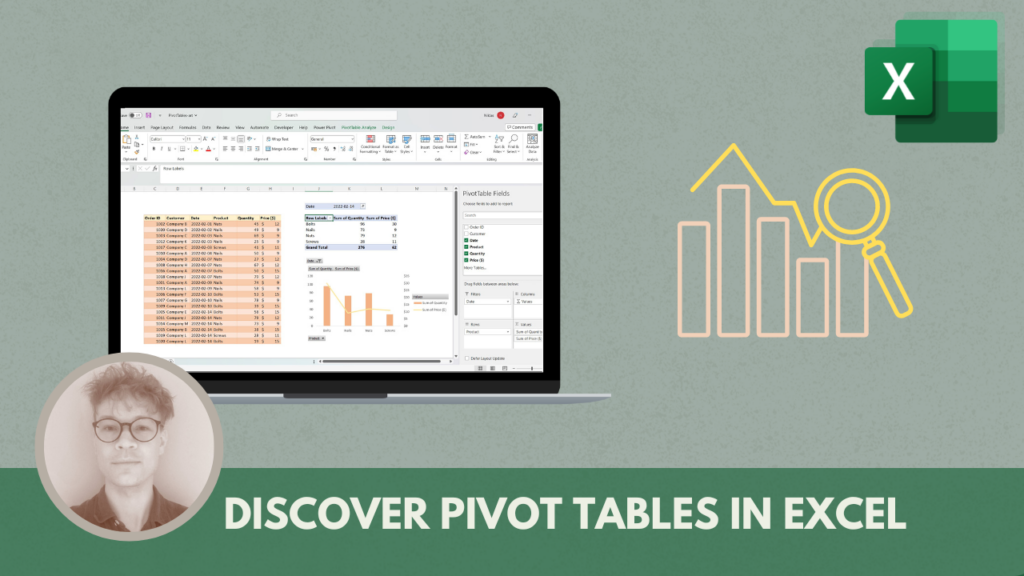
In this case, the word table refers to structured data in rows and columns. So it includes more than just actual Excel tables. For example pivot tables which are excellent for aggregating and summarizing data. It can also be a matrix or a range of cells for which you can apply a color scale, so-called conditional formatting. This is an effective way to quickly let a recipient of the dashboard get the necessary information.
In the example below, conditional formatting has been applied to sales data with an associated legend. Here you can quickly see that low values have a shade of red, and high values have a shade of blue.
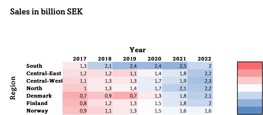
Figure 1: example of a cell range with conditional formatting with associated legend.
Line chart
Line charts are especially good for showing change and trends over time. You can also compare several data series over time. What you should keep in mind is that you don’t add too many series.
The example below shows two series in a line chart. Here you can easily see that China’s emissions have continued to increase after year 2005 when The Paris Agreement was concluded. The USA’s emissions have instead decreased somewhat.
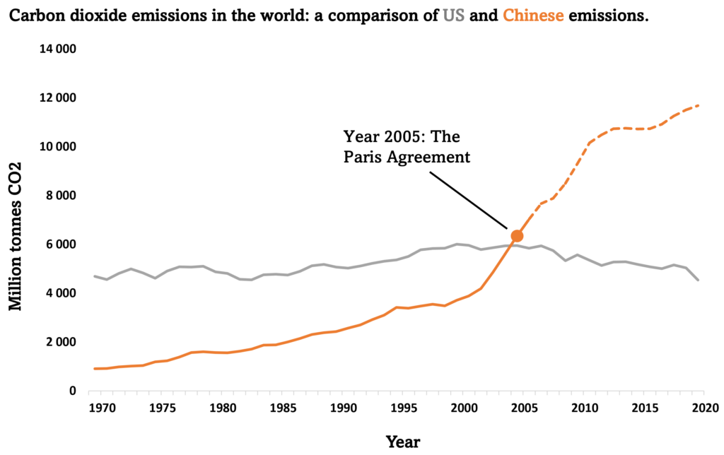
Figure 2: two data series comparing the two countries’ emissions overtime with an important break point at the year 2005.
Bar chart
As previously mentioned, the bar graph is very useful, but is mainly used to compare categorical data. It could replace the line graph above, but a line graph explains change over time in a better way. It had resulted in a lot of bars and would not have been as clear as a line chart. In addition to the line chart, the bar chart is closely related to several other chart options in Excel. More on this in the next part.
In the example below, greenhouse gas emissions per capita are visualized:
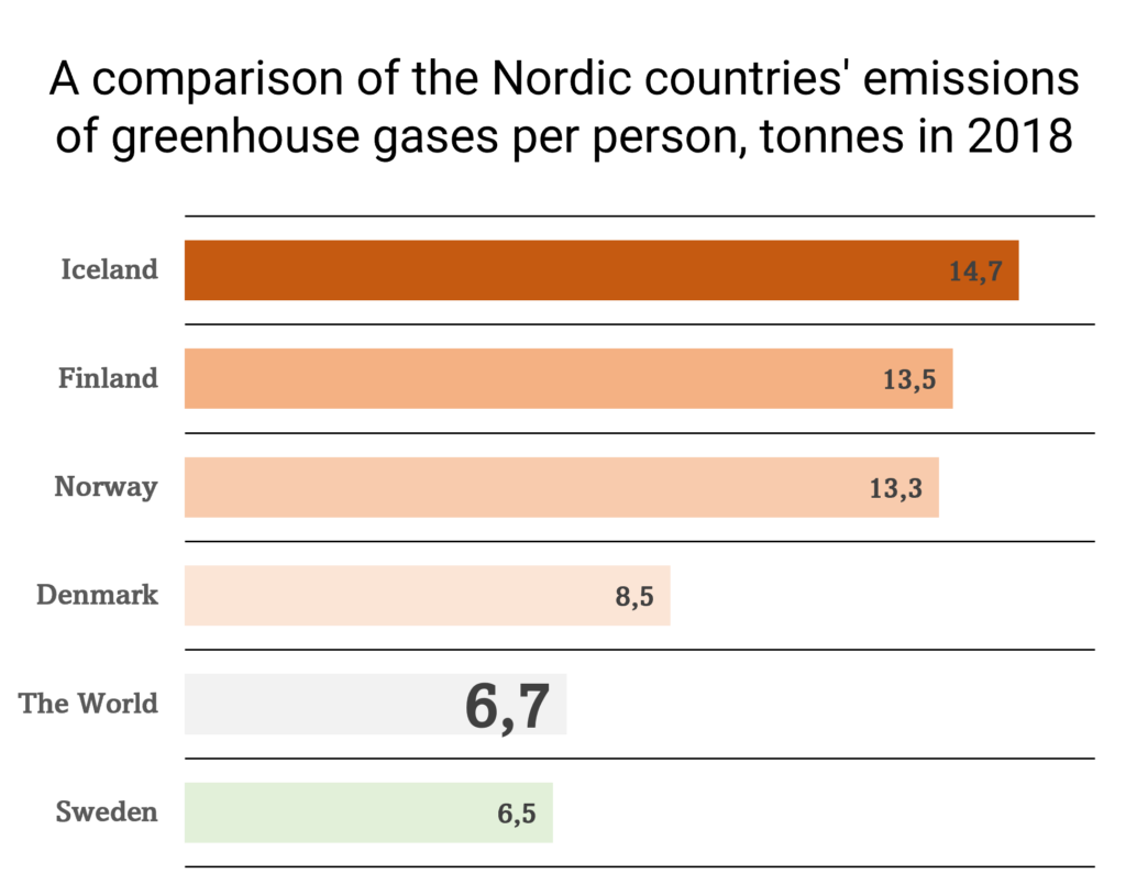
Figure 3: a horizontal bar chart where the bars go from green to red depending on how many tons of greenhouse gases per capita the countries account for.
In this comparison of the Nordic countries, a color scale from green to red is used to mark that Sweden is below the average for the world when it comes to emissions of greenhouse gases. In this case, a horizontal bar chart is used. It would have gone just as well with a vertical bar chart, but a reader of the dashboard can then at first glance get the impression that it is some kind of trend. This is especially important to consider if you use bar charts for a shorter time series.
Pie chart
Pie charts are meant to show composition with categorical data, and they can do that effectively. The problem is that there are far too many ways to make inefficient pie charts, showing too many segments, failing to sort them, or adding 3D effects.
If you’re using a pie chart, remember to sort those slices and try to keep them under five total. If possible, focus on one versus the rest.
In the first example, we see a regular pie chart with a total of four slices.
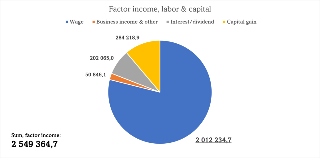
Figure 4: a standard pie chart where the category with the largest share is highlighted.
This works well when the number of categories is less than five. In the second example below, we see how instead all categories except one are grouped. This is a good option if you have a lot of categories, but still want to visualize shares.
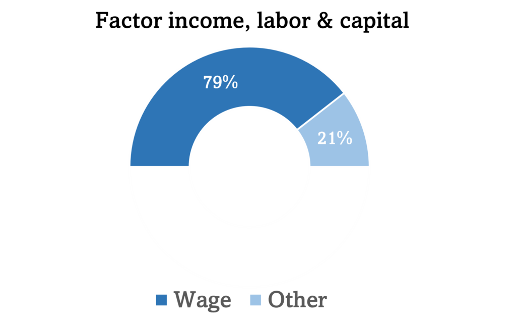
Figure 5: a half pie chart where one category is plotted against the rest. This pie chart shows the selected category and summarizes the remaining ones.
Conclusion
These four visualizations are probably familiar to most people. What is also important to consider is to keep it simple for the readability of your dashboard. Therefore, you should consider including these visualizations in your dashboard, as these are very uncomplicated.
The next part will deal with four other visualizations. Until then, you can read other articles, or subscribe to our newsletter. Or, ask your questions about Excel in our forum. Maybe you want to reproduce some of the diagrams?
/Niklas at Learnesy