📆 14-day money-back guarantee | 🔃 Switch courses anytime | 🔒 Secure payment and fast support

How do you create a Gantt chart in Excel?

How do you create a Gantt chart in Excel?

Microsoft offers its 365 subscribers downloadable templates for Gantt charts, but there is still no built-in Gantt chart in Excel. Therefore, this post will focus on how to create one completely from scratch.

What is a Gantt chart?

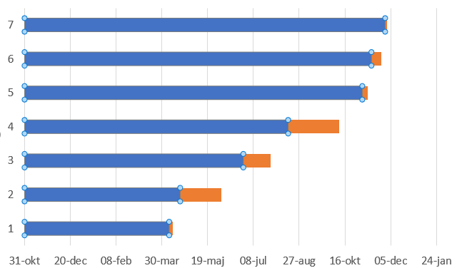
A Gantt chart is used in project management and is a type of flow chart that visualizes time aspects, phases, and dependencies within a project. The creator was Henry Gantt, who designed the chart in the early 20th century. The chart illustrates how a project is intended to progress or how an ongoing project is advancing.

A Gantt chart is a horizontal bar chart that runs along a timeline. Variations in the length of the bars represent the duration planned for each task in the project. There are also ways to visualize how much of a task remains in a project by shading or darkening the completed portion of an activity. The bars are sorted according to the tasks’ respective start times because some activities depend on the completion of others.

Gantt charts often include milestones. A milestone is a specific point in time that is relevant to the project, such as the completion of a software program. Often, you will see a row of bars (activities) leading up to the milestone. The milestone is usually represented as a diamond and can signify the end of a project or the starting point for new activities.

How do you create a Gantt chart in Excel?

Below, we will explain how to create a Gantt chart from start to finish. Note that Excel 365 is being used here; if you have an older version, there may be some differences in the steps.

Gantt practice file

Add your project schedule as a table

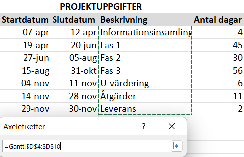
Break the work into segments, phases, activities, or whatever you choose to call them. These tasks form the basis for the Gantt chart.

Enter data by first specifying the start and end dates for each task, along with the number of days required to complete the task. It can be helpful to include a longer description of the task, which can be added as a note or comment. The tasks should be sorted by earliest start date.
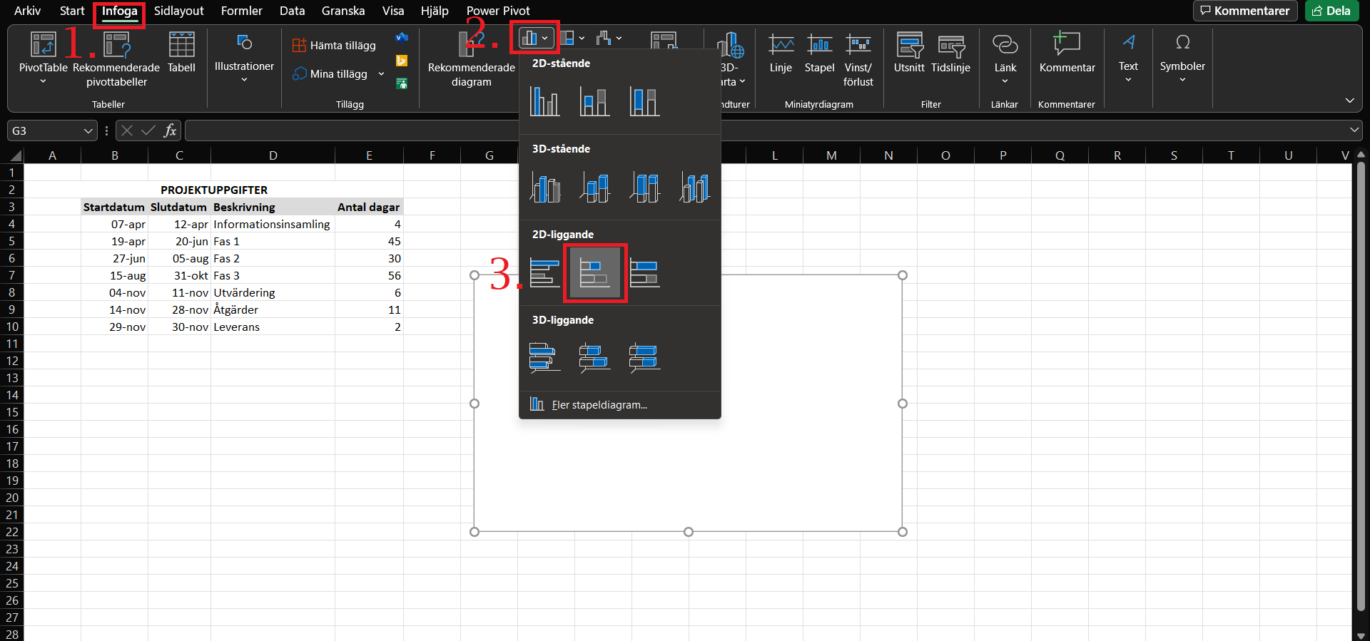
Insert a bar chart

Select any cell, preferably somewhere to the right of the table. Go to the Insert tab and choose Insert Bar Chart, then select Stacked Bar.

How to add start dates

Right-click on the white area that will soon become the Gantt chart. Then click Select Data. In the dialog box that appears, click Add. Click the small arrow under Series name, select the header “Start Date,” and then click the small black arrow to return. Next, go down to Series values and select all the start dates (without the header). Click OK, but stay in the dialog box that reappeared.

Add duration

Click Add again and repeat the same procedure for “Number of Days.” For Series name, select “Number of Days,” and for Series values, select the range containing the “Number of Days.”

Back in the dialog box, click OK this time. The Gantt chart will start to take shape and should look something like this (see image below), but descriptions still need to be added for the individual project tasks.

How to add descriptions

Click on a bar in the nearly completed Gantt chart, then right-click the same bar. Click Select Data as before. In the dialog box, click Edit in the right-hand field. Repeat the process in a similar way, but this time select the range containing the “Descriptions” without including the header. Then go back and click OK.

How to format the bars

Even though the chart is starting to take the shape of a Gantt chart, some formatting is still needed. The blue parts of the bars should be made transparent so that only the orange parts are visible.

Click on a few of the bars so that all are selected. If only one bar is selected, click in an empty cell and try again. Only the blue parts should be selected. Then right-click any bar and choose Format Data Series. On the right side of the worksheet, a menu called Format Axis should appear. Click Fill & Line (the paint bucket icon). Under Fill, select No Fill from the dropdown menu.

Note that the project tasks in the Gantt chart are reversed; the last task is at the top and vice versa. This is easy to fix. Click on the chart where the task descriptions or names are listed. Make sure the list is selected by ensuring a rectangle surrounds the entire list.

On the right, Format Axis should appear again. Click Axis Options (the icon that looks like a bar chart). Then go to the Axis Options menu. From the dropdown, select Categories in reverse order under Axis Position.

The order is now reversed, and note that the dates have moved to the top instead of being at the bottom as before.

Finishing touches

At this stage, the Gantt chart is practically complete, but some fine-tuning is needed. The first step is to trim some of the white space, much of which is left by the blue bars.

Do this by clicking on any of the dates at the top of the chart to select them all. Right-click and choose Format Axis. Under Axis Options, go to Bounds, and in Minimum, you can try adjusting the value to get it as you want. Increasing this value will push the task descriptions closer to the vertical axis (what we usually call the y-axis). I ended up using 44,495*.

*Those paying attention will notice the date axis looks a bit odd. This is because Excel automatically formatted it. If you encounter the same issue, instead of an arbitrary value, enter your first start date in Minimum and your last in Maximum, or a date just before your first start and just after your last. Experiment to see what works best.

Do the same for Major Unit under Units, and observe the changes. Increasing this value will spread out the dates and reduce the number of dates shown. Depending on your data range and timeline, you may need to experiment. In my case, I used 55 to keep dates close together without making them unreadable. Use Reset to restore previous values if needed.

Change the bar thickness by clicking on any bar again, and (if not already open) open the Format Data Series menu by right-clicking a bar. Under Series Options, adjust the Gap Width. Lower values make thicker bars and vice versa. I settled on 60%.

As the finishing touch, you can add a title to the Gantt chart, change the bar colors, modify fonts, add shadows, gridlines, and more. You can also try a prebuilt layout to see how it looks. For demonstration, I’ll make a few of these changes.

To change bar colors, click the paint bucket in Format Data Series and choose a color.

To add a chart title, click anywhere on the chart. A plus sign will appear in the top-right corner outside the chart—these are Chart Elements. Check Chart Title and double-click the title to edit it.

Also, make task descriptions bold by clicking a description and ensuring all descriptions are within the small rectangle that appears. Right-click and choose Font to bold text, change font, italicize, or change colors.

And there you have it—a fairly simple Gantt chart. As mentioned, experiment to see what works best. Some adjustments may be necessary for the final look. You can try a prebuilt chart layout, but you will likely need to remove the blue bars again.

A Gantt chart can also be created in Word or PowerPoint, and there are ready-made templates for Excel, PowerPoint, and Word.

/ Niklas at Learnesy


Leave a Reply

You must be logged in to post a comment.

More blog posts