


Linear vs. Logarithmic Scales in Charts
Choosing between a linear and a logarithmic scale can make a big difference in how your data is presented and interpreted. But what is the actual difference, and when should you use each? In this article, we explain the basics and guide you through the advantages and use cases of both scales—so you can create clear and effective visualizations every time.
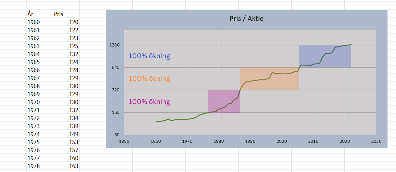
Charts in Excel are automatically plotted on a linear scale. A linear scale is simply a scale where all intervals are equally spaced. However, there are several situations where a linear scale is not ideal for visualizing data.
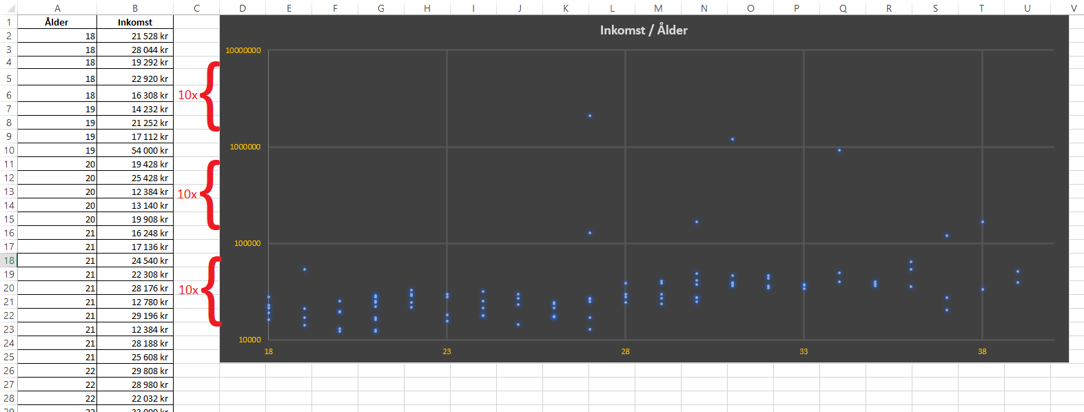
Let’s look at two cases where a logarithmic scale proves useful. First, consider an example mapping age against gross income for 100 individuals (displayed as a scatter plot).
Even though one might assume income grows with age, it can be difficult to see this trend in the chart because some individuals have incomes that are multiples of the majority, which skews the visualization.
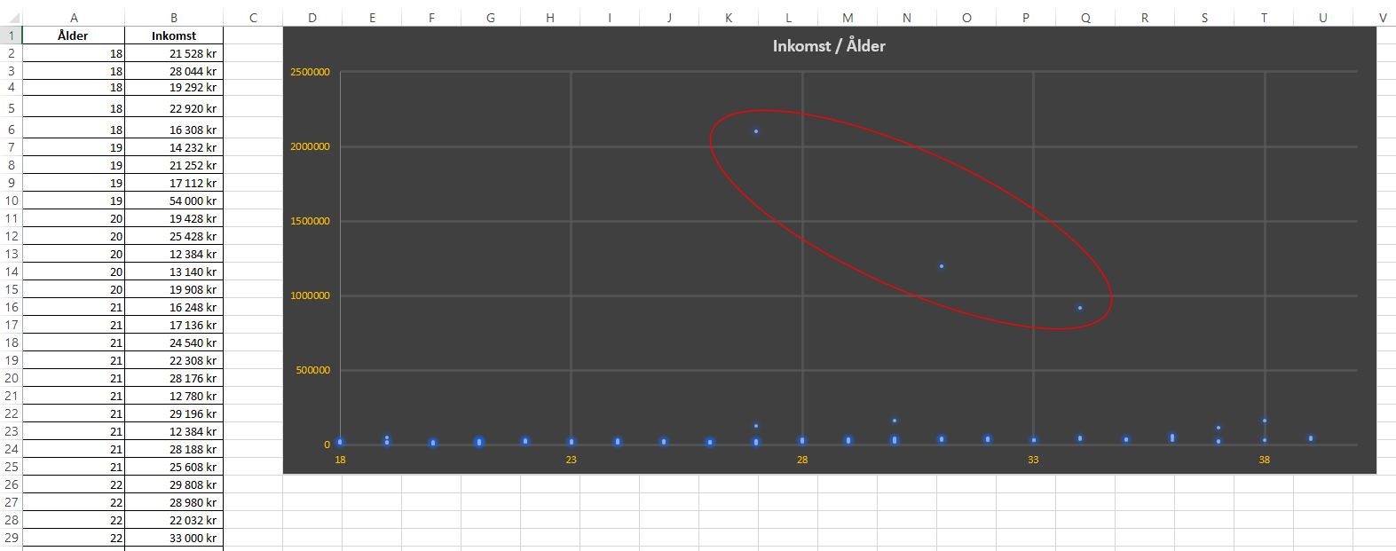
Since each interval on the y-axis is equally sized, lower incomes get compressed in the chart as each interval is added to accommodate the highest values in the data series.
This issue can be solved using a logarithmic scale. Unlike linear scales, a logarithmic scale is defined as: the previous interval value multiplied by a base value.

The basic idea is to compress high values in order to maintain a high “resolution” among the lower values.
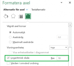
>> To change an axis to a logarithmic scale in Excel, right-click the axis and select “Format Axis.” Then click “Logarithmic scale” and enter the base value.